分享十个CSS3鼠标滑过文字动画特效
阅读:3136
时间:2018-02-01 03:26
天要介绍10组基于CSS3的鼠标滑过文字动画特效,有上凸、下凹等文字动画。这些炫酷的CSS3文字效果可以让网页变得更加绚丽。效果图如下: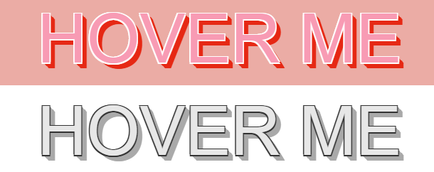
实现的代码。
html代码:
 <h2 class="headingOuter">
        Push down (shadow effect)</h2>
    <div class="headingWrapper color-bright">
        <a href="" class="header header--pushDown header--shadow" title="HOVER ME">HOVER ME</a>
    </div>
    <div class="headingWrapper">
        <a href="" class="header header--pushDown header--shadow" title="HOVER ME">HOVER ME</a>
    </div>
    <h2 class="headingOuter">
        Raise up (shadow effect)</h2>
    <div class="headingWrapper color-bright">
        <a href="" class="header header--raiseUp header--shadow">HOVER ME</a>
    </div>
    <div class="headingWrapper">
        <a href="" class="header header--raiseUp header--shadow">HOVER ME</a>
    </div>
    <h2 class="headingOuter">
        Push down (merging into page)</h2>
    <div class="headingWrapper color-bright">
        <a href="" class="header header--pushDown">HOVER ME</a>
    </div>
    <div class="headingWrapper">
        <a href="" class="header header--pushDown">HOVER ME</a>
    </div>
    <h2 class="headingOuter">
        Raise up (emerging from page)</h2>
    <div class="headingWrapper color-bright">
        <a href="" class="header header--raiseUp">HOVER ME</a>
    </div>
    <div class="headingWrapper">
        <a href="" class="header header--raiseUp">HOVER ME</a>
    </div>
    <h2 class="headingOuter">
        Raised up (emerging from bg) with pattern</h2>
    <div class="headingWrapper color-bright">
        <a href="#" class="header header--raiseUp header--svg">
            <svg>
                <defs>
                    <lineargradient id="stripedColor" x1="0" x2="0" y1="0%" y2="4%" spreadmethod="repeat">
                        <stop offset="0%" stop-color="#e62915" />
                        <stop offset="50%" stop-color="#e62915" />
                        <stop offset="51%" stop-color="#fff" />
                        <stop offset="99%" stop-color="#fff" />
                        <stop offset="100%" stop-color="#e62915" />
                    </lineargradient>
                </defs>
                <text y="1.2em">Hover Me</text>
            </svg>
        </a>
    </div>
    <div class="headingWrapper">
        <a href="#" class="header header--raiseUp header--svg">
            <svg>
                <defs>
                    <lineargradient id="striped" x1="0" x2="0" y1="0%" y2="4%" spreadmethod="repeat">
                        <stop offset="0%" stop-color="#e62915" />
                        <stop offset="50%" stop-color="#e62915" />
                        <stop offset="51%" stop-color="#fff" />
                        <stop offset="99%" stop-color="#fff" />
                        <stop offset="100%" stop-color="#e62915" />
                    </lineargradient>
                </defs>
                <text y="1.2em">Hover Me</text>
            </svg>
        </a>
    </div>
css3代码:
@charset "UTF-8";
* {
  box-sizing: border-box;
}

body {
  font-size: 62.5%;
}

h1, h2, h3 {
  font-family: 'PT Sans', sans-serif;
  text-transform: uppercase;
}

h1 {
  font-size: 2.4em;
  background-color: #292929;
  text-align: center;
  padding: 20px;
  margin: 0;
  color: #fff;
}
h1 a {
  display: block;
  margin-top: 10px;
  text-transform: none;
  color: #aaa;
  font-size: 16px;
  text-decoration: none;
}

h2 {
  font-size: 1.6em;
  margin: 0;
  padding: 10px;
  border-top: 1px solid #ccc;
}

h3 {
  margin: 0;
  padding: 10px;
}

.headingOuter {
  background: #f1f1f1;
  text-align: center;
  margin-top: 30px;
  border-top: 1px solid #333;
  border-bottom: 1px solid #333;
}
.headingOuter:first-child {
  margin-top: 0;
}
h1 + .headingOuter {
  margin-top: 10px;
}

.headingWrapper {
  text-align: center;
  background-color: #fff;
  padding: 10px;
}

.header {
  display: inline-block;
  text-align: center;
  font-family: 'Francois One', Helvetica, Arial, sans-serif;
  font-size: 96px;
  color: #e7e7e7;
  text-decoration: none;
  text-shadow: 1.5px 1.5px 0 #cac6c5, -1.5px -1.5px 0 #cac6c5, -1.5px -1.5px 0 #cac6c5, -1.5px 1.5px 0 #cac6c5, 1.5px -1.5px 0 #cac6c5;
  transition: all 400ms ease-in-out;
}

.header--pushDown {
  text-shadow: 1.5px 1.5px 0 #333, 0px 1.5px 0 #333, -1.5px -1.5px 0 #333, -1.5px -1.5px 0 #333, -1.5px 1.5px 0 #333, 1.5px -1.5px 0 #333, 0.77782px 0.77782px 0 #aaaaaa, 1.55563px 1.55563px 0 #aaaaaa, 2.33345px 2.33345px 0 #aaaaaa, 3.11127px 3.11127px 0 #aaaaaa, 3.88909px 3.88909px 0 #aaaaaa, 4.6669px 4.6669px 0 #aaaaaa, 5.44472px 5.44472px 0 #aaaaaa, 6.22254px 6.22254px 0 #aaaaaa, 7.00036px 7.00036px 0 #aaaaaa, 7.77817px 7.77817px 0 #aaaaaa;
}
.header--pushDown:hover {
  transform: translate(9px, 9px);
  text-shadow: 1.5px 1.5px 0 #cac6c5, -1.5px -1.5px 0 #cac6c5, -1.5px -1.5px 0 #cac6c5, -1.5px 1.5px 0 #cac6c5, 1.5px -1.5px 0 #cac6c5;
}

.header--raiseUp:hover {
  transform: translate(-9px, -9px);
  text-shadow: 1.5px 1.5px 0 #333, 0px 1.5px 0 #333, -1.5px -1.5px 0 #333, -1.5px -1.5px 0 #333, -1.5px 1.5px 0 #333, 1.5px -1.5px 0 #333, 0.77782px 0.77782px 0 #aaaaaa, 1.55563px 1.55563px 0 #aaaaaa, 2.33345px 2.33345px 0 #aaaaaa, 3.11127px 3.11127px 0 #aaaaaa, 3.88909px 3.88909px 0 #aaaaaa, 4.6669px 4.6669px 0 #aaaaaa, 5.44472px 5.44472px 0 #aaaaaa, 6.22254px 6.22254px 0 #aaaaaa, 7.00036px 7.00036px 0 #aaaaaa, 7.77817px 7.77817px 0 #aaaaaa;
}

.header--shadow:hover {
  transform: translate(5px, 0);
}
.header--shadow.header--raiseUp:hover {
  transform: translate(-5px, 0);
}

.color-bright {
  background-color: #ebaca5;
}
.color-bright .header {
  color: #f89bb4;
  text-shadow: 1.5px 1.5px 0 #d38076, -1.5px -1.5px 0 #d38076, -1.5px -1.5px 0 #d38076, -1.5px 1.5px 0 #d38076, 1.5px -1.5px 0 #d38076;
}
.color-bright .header--pushDown {
  text-shadow: 1.5px 1.5px 0 #fff, 0px 1.5px 0 #fff, -1.5px -1.5px 0 #fff, -1.5px -1.5px 0 #fff, -1.5px 1.5px 0 #fff, 1.5px -1.5px 0 #fff, 0.77782px 0.77782px 0 #e62915, 1.55563px 1.55563px 0 #e62915, 2.33345px 2.33345px 0 #e62915, 3.11127px 3.11127px 0 #e62915, 3.88909px 3.88909px 0 #e62915, 4.6669px 4.6669px 0 #e62915, 5.44472px 5.44472px 0 #e62915, 6.22254px 6.22254px 0 #e62915, 7.00036px 7.00036px 0 #e62915, 7.77817px 7.77817px 0 #e62915;
}
.color-bright .header--pushDown:hover {
  text-shadow: 1.5px 1.5px 0 #d38076, -1.5px -1.5px 0 #d38076, -1.5px -1.5px 0 #d38076, -1.5px 1.5px 0 #d38076, 1.5px -1.5px 0 #d38076;
}
.color-bright .header--raiseUp:hover {
  text-shadow: 1.5px 1.5px 0 #fff, 0px 1.5px 0 #fff, -1.5px -1.5px 0 #fff, -1.5px -1.5px 0 #fff, -1.5px 1.5px 0 #fff, 1.5px -1.5px 0 #fff, 0.77782px 0.77782px 0 #e62915, 1.55563px 1.55563px 0 #e62915, 2.33345px 2.33345px 0 #e62915, 3.11127px 3.11127px 0 #e62915, 3.88909px 3.88909px 0 #e62915, 4.6669px 4.6669px 0 #e62915, 5.44472px 5.44472px 0 #e62915, 6.22254px 6.22254px 0 #e62915, 7.00036px 7.00036px 0 #e62915, 7.77817px 7.77817px 0 #e62915;
}

svg {
  line-height: 1.2;
  width: 410px;
  height: 1.5em;
}

.header--svg text,
.header--svg stop {
  transition: all 350ms ease-in-out;
}
.header--svg text {
  text-transform: uppercase;
  fill: url(#striped);
  text-shadow: 1.5px 1.5px 0 #cac6c5, -1.5px -1.5px 0 #cac6c5, -1.5px -1.5px 0 #cac6c5, -1.5px 1.5px 0 #cac6c5, 1.5px -1.5px 0 #cac6c5;
}
.header--svg:hover text {
  text-shadow: 1.5px 1.5px 0 #333, 0px 1.5px 0 #333, -1.5px -1.5px 0 #333, -1.5px -1.5px 0 #333, -1.5px 1.5px 0 #333, 1.5px -1.5px 0 #333, 0.77782px 0.77782px 0 #aaaaaa, 1.55563px 1.55563px 0 #aaaaaa, 2.33345px 2.33345px 0 #aaaaaa, 3.11127px 3.11127px 0 #aaaaaa, 3.88909px 3.88909px 0 #aaaaaa, 4.6669px 4.6669px 0 #aaaaaa, 5.44472px 5.44472px 0 #aaaaaa, 6.22254px 6.22254px 0 #aaaaaa, 7.00036px 7.00036px 0 #aaaaaa, 7.77817px 7.77817px 0 #aaaaaa;
}
.header--svg stop {
  stop-color: #e7e7e7;
}
.header--svg:hover stop {
  stop-color: #fff;
}
.header--svg:hover stop:nth-child(2), .header--svg:hover stop:nth-child(3) {
  stop-color: #d38076;
}

.color-bright .header--svg text {
  fill: url(#stripedColor);
  text-shadow: 1.5px 1.5px 0 #d38076, -1.5px -1.5px 0 #d38076, -1.5px -1.5px 0 #d38076, -1.5px 1.5px 0 #d38076, 1.5px -1.5px 0 #d38076;
}
.color-bright .header--svg:hover text {
  text-shadow: 1.5px 1.5px 0 #fff, 0px 1.5px 0 #fff, -1.5px -1.5px 0 #fff, -1.5px -1.5px 0 #fff, -1.5px 1.5px 0 #fff, 1.5px -1.5px 0 #fff, 0.77782px 0.77782px 0 #e62915, 1.55563px 1.55563px 0 #e62915, 2.33345px 2.33345px 0 #e62915, 3.11127px 3.11127px 0 #e62915, 3.88909px 3.88909px 0 #e62915, 4.6669px 4.6669px 0 #e62915, 5.44472px 5.44472px 0 #e62915, 6.22254px 6.22254px 0 #e62915, 7.00036px 7.00036px 0 #e62915, 7.77817px 7.77817px 0 #e62915;
}
.color-bright stop {
  stop-color: #f89bb4;
}
.color-bright .header--svg:hover stop:nth-child(2), .color-bright .header--svg:hover stop:nth-child(3) {
  stop-color: #ed5751;
}
via:http://www.w2bc.com/Article/18183


版权所有 爱编程 © Copyright 2012. All Rights Reserved.
闽ICP备12017094号-3
闽ICP备12017094号-3