基于js全屏动画焦点图幻灯片
阅读:2130
时间:2018-02-01 03:26
今天给大家分享一款基于js全屏动画焦点图幻灯片。这款焦点图内的内容以动画形式出现和消失。效果图如下:
实现的代码。
html代码:
<div class="slideshow" id="slideshow">
<ol class="slides">
<li class="current">
<div class="description">
<h2>
Tilted Content Slideshow</h2>
<p>
This slider, as seen on the landing page of the <a href="http://www.w2bc.com/">FWA</a>,
plays with 3D perspective and performs some interesting animations on the right-hand
side images.</p>
</div>
<div class="tiltview col">
<a href="http://www.w2bc.com/">
<img src="img/1_screen.jpg" /></a> <a href="https://www.w2bc.com/">
<img src="img/2_screen.jpg" /></a>
</div>
</li>
<li>
<div class="description">
<h2>
CSS Animations</h2>
<p>
We are using 12 different animations for showing and hiding the items of a slide.
The animations are defined by randomly adding data-attributes called <code>data-effect-in</code>
and <code>data-effect-out</code> for every slide.
</p>
</div>
<div class="tiltview row">
<a href="http://www.w2bc.com/">
<img src="img/3_mobile.jpg" /></a> <a href="http://www.w2bc.com/">
<img src="img/4_mobile.jpg" /></a>
</div>
</li>
<li>
<div class="description">
<h2>
Tilted Items</h2>
<p>
The perspective view is achieved by adding a perspective value to the slide list
item and tilting a division that contains the two screenshots.</p>
</div>
<div class="tiltview col">
<a href="http://www.w2bc/">
<img src="img/5_screen.jpg" /></a> <a href="http://www.w2bc.com/">
<img src="img/6_screen.jpg" /></a>
</div>
</li>
<li>
<div class="description">
<h2>
Column or Row</h2>
<p>
The items in the tilted container are either laid out in a column or in a row. For
some directions we need to adjust the animation delays for the items, since we don't
want the items to overlap each other when they move in or out.</p>
</div>
<div class="tiltview row">
<a href="http://www.w2bc/">
<img src="img/1_mobile.jpg" /></a> <a href="https://tsovet.com/">
<img src="img/2_mobile.jpg" /></a>
</div>
</li>
<li>
<div class="description">
<h2>
Responsiveness</h2>
<p>
For smaller screens, the items on the right hand side will become less opaque and
serve as decoration only. The focus will be on the description which will occupy
all the width.</p>
</div>
<div class="tiltview col">
<a href="http://www.w2bc.com/">
<img src="img/3_screen.jpg" /></a> <a href="http://foodsense.is/">
<img src="img/4_screen.jpg" /></a>
</div>
</li>
<li>
<div class="description">
<h2>
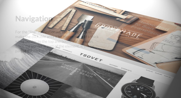
Navigation</h2>
<p>
For the "line" navigation we use a little trick to make the clickable area a bit
bigger: we add a thick white border to the top and bottom of the span. Since the
border is part of the element, it will be part of the clickable zone.</p>
</div>
<div class="tiltview row">
<a href="http://www.w2bc.com/">
<img src="img/5_mobile.jpg" /></a> <a href="http://www.herschelsupply.com/">
<img src="img/6_mobile.jpg" /></a>
</div>
</li>
</ol>
</div>
via:http://www.w2bc.com/Article/23685


版权所有 爱编程 © Copyright 2012. All Rights Reserved.
闽ICP备12017094号-3
闽ICP备12017094号-3