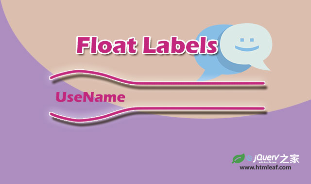
12种炫酷HTML5 SVG和CSS3表单浮动标签特效
阅读:1845
时间:2018-02-01 03:26
这是一组效果非常炫酷的HTML5 SVG和CSS3表单浮动标签特效。这组浮动标签特效共12种效果,使用SVG和CSS3来制作完成。这些浮动标签效果部分在元素的伪元素上使用CSS transitions和CSS animations完成,一部分则使用SVG来制作变形动画。
HTML结构
这一组浮动标签特效最大的特点就是引入了SVG,使用SVG来制作各种图形变形动画,其中“SHOKO”的效果如下图所示:
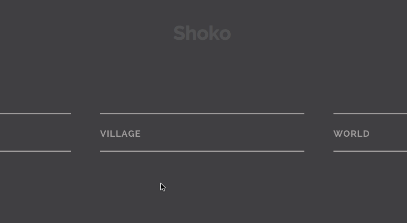
这个效果的HTML结构如下:
<span class="input input--shoko">
  <input class="input__field input__field--shoko" type="text" id="input-4" />
  <label class="input__label input__label--shoko" for="input-4">
    <span class="input__label-content input__label-content--shoko">Player Name</span>
  </label>
  <svg class="graphic graphic--shoko" width="300%" height="100%" viewBox="0 0 1200 60" preserveAspectRatio="none">
    <path d="M0,56.5c0,0,298.666,0,399.333,0C448.336,56.5,513.994,46,597,46c77.327,0,135,10.5,200.999,10.5c95.996,0,402.001,0,402.001,0"/>
    <path d="M0,2.5c0,0,298.666,0,399.333,0C448.336,2.5,513.994,13,597,13c77.327,0,135-10.5,200.999-10.5c95.996,0,402.001,0,402.001,0"/>
  </svg>
</span>
可以看到,两条线是使用SVG的
CSS样式
在样式设计上,首先给标签文本和input输入框及SVG线条一些基本的样式:
.input--shoko {
  overflow: hidden;
  padding-bottom: 2.5em;
}

.input__field--shoko {
  padding: 0;
  margin-top: 1.2em;
  width: 100%;
  background: transparent;
  color: #fff;
  font-size: 1.55em;
}

.input__label--shoko {
  position: absolute;
  top: 2em;
  left: 0;
  display: block;
  width: 100%;
  text-align: left;
  padding: 0em;
  text-transform: uppercase;
  letter-spacing: 1px;
  color: #A09C9C;
  pointer-events: none;
  -webkit-transform-origin: 0 0;
  transform-origin: 0 0;
  -webkit-transition: -webkit-transform 0.2s 0.1s, color 0.3s;
  transition: transform 0.2s 0.1s, color 0.3s;
  -webkit-transition-timing-function: ease-out;
  transition-timing-function: ease-out;
}

.graphic--shoko {
  stroke: #A09C9C;
  pointer-events: none;
  stroke-width: 2px;
  top: 1.25em;
  bottom: 0px;
  height: 3.275em;
  -webkit-transition: -webkit-transform 0.7s, stroke 0.7s;
  transition: transform 0.7s, stroke 0.7s;
  -webkit-transition-timing-function: cubic-bezier(0, 0.25, 0.5, 1);
  transition-timing-function: cubic-bezier(0, 0.25, 0.5, 1);
}
via:http://www.w2bc.com/Article/30052


版权所有 爱编程 © Copyright 2012. All Rights Reserved.
闽ICP备12017094号-3
闽ICP备12017094号-3