css3实现的4种动画特效按钮
阅读:1521
时间:2018-02-01 03:25
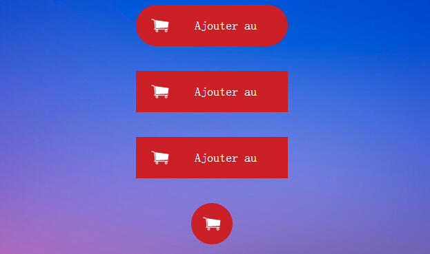
今天要给大家介绍的是css3按钮,里面包含四种特效的动画,如下图:
实现html代码:
<div align="center" class="fond">
<br />
<div class="bouton_1">
<a href="#123">
<img src="caddie.png" />
<span class="texteduboutton_1">Ajouter au panier</span></a>
</div>
<br />
<br />
<div class="bouton_2">
<a href="#123">
<img src="caddie.png" />
<span class="texteduboutton_2">Ajouter au panier</span></a>
</div>
<br />
<br />
<div class="bouton_3">
<a href="#123">
<img src="caddie.png" />
<span class="texteduboutton_3">Ajouter au panier</span></a>
</div>
<br />
<br />
<div class="bouton_4">
<a href="#123">
<img src="caddie.png" />
<span class="texteduboutton_4">Add to cart</span></a>
</div>
<br />
<br />
</div>
实现的css代码:
.fond{position:fixed;padding-top:px;top:0;left:0; right:0;bottom:0;
  background-image:url(fond_4.jpg);background-size:cover;overflow-y:auto;}

/*///////////////////////////////BOUTON _ 1///////////////////////////////////////*/
.bouton_1{
    width:200px;
    height:40px;
    padding:10px;
    border-radius:40px;
    background-color:#CB2025;
    overflow:hidden;
    -webkit-transition:all 0.2s ease-in;
    -moz-transition:all 0.2s ease-in;
    -ms-transition:all 0.2s ease-in;
    -o-transition:all 0.2s ease-in;
    transition:all 0.2s ease-in;
}
.bouton_1:hover{
    width:40px;
    height:40px;
    border-radius:40px;
    background-color:#60121C;
}
.texteduboutton_1
{
    width:70%;
    padding-right: 10px;
    float:right;
    line-height:40px;
    color:#ffffff;
    font-family:'Roboto';
    font-weight:300;
    font-size:18px;
}

/*///////////////////////////////BOUTON _ 2///////////////////////////////////////*/
.bouton_2{
    width:200px;
    height:40px;
    padding:10px;
    background-color:#CB2025;
    overflow:hidden;
    -webkit-transition: all 0.5s ease-out;
    -moz-transition: all 0.5s ease-out;
    -ms-transition: all 0.5s ease-out;
    -o-transition: all 0.5s ease-out;
    transition: all 0.5s ease-out;
}
.bouton_2:hover{
    width:40px;
    height:40px;
    background-color:#60121C;
    -webkit-transform:rotateZ(360deg);
    -moz-transform:rotateZ(360deg);
    -ms-transform:rotateZ(360deg);
    -o-transform:rotateZ(360deg);
    transform:rotateZ(360deg);
}
.texteduboutton_2
{
    width:70%;
    padding-right: 10px;
    float:right;
    line-height:40px;
    color:#ffffff;
    font-family:'Roboto';
    font-weight:300;
    font-size:18px;
}
/*///////////////////////////////BOUTON _ 3///////////////////////////////////////*/

.bouton_3{
    overflow:hidden;
    width:200px;
    height:40px;
    padding:10px;
    background-color:#CB2025;
}
.bouton_3:hover{
    width:40px;
    height:40px;
    background-color:#60121C;
    -webkit-animation: anim_trois 1.2s;
    -moz-animation: anim_trois 1.2s;
    -ms-animation: anim_trois 1.2s;
    -o-animation: anim_trois 1.2s;
    animation: anim_trois 1.2s;
}
.texteduboutton_3
{
    width:70%;
    padding-right: 10px;
    float:right;
    line-height:40px;
    color:#ffffff;
    font-family:'Roboto';
    font-weight:300;
    font-size:18px;
}
@-webkit-keyframes anim_trois {
    0% {
        width:200px;
        -webkit-transform: perspective( 600px ) rotateY( 0deg );
    }
    50% {
        width:40px;
        height:40px;
        -webkit-transform: perspective( 600px ) rotateY( 0deg );
    }
    100% {
        width:40px;
        height:40px;
        background-color:#60121C;
        -webkit-transform: perspective( 600px ) rotateY( 180deg );
    }
}
@-moz-keyframes anim_trois {
    0% {
        width:200px;
        -moz-transform: perspective( 600px ) rotateY( 0deg );
    }
    50% {
        width:40px;
        height:40px;
        -moz-transform: perspective( 600px ) rotateY( 0deg );
    }
    100% {
        width:40px;
        height:40px;
        background-color:#60121C;
        -moz-transform: perspective( 600px ) rotateY( 180deg );
    }
}
@-ms-keyframes anim_trois {
    0% {
        width:200px;
        -ms-transform: perspective( 600px ) rotateY( 0deg );
    }
    50% {
        width:40px;
        height:40px;
        -ms-transform: perspective( 600px ) rotateY( 0deg );
    }
    100% {
        width:40px;
        height:40px;
        background-color:#60121C;
        -ms-transform: perspective( 600px ) rotateY( 180deg );
    }
}
@-o-keyframes anim_trois {
    0% {
        width:200px;
        -o-transform: perspective( 600px ) rotateY( 0deg );
    }
    50% {
        width:40px;
        height:40px;
        -o-transform: perspective( 600px ) rotateY( 0deg );
    }
    100% {
        width:40px;
        height:40px;
        background-color:#60121C;
        -o-transform: perspective( 600px ) rotateY( 180deg );
    }
}
@keyframes anim_trois {
    0% {
        width:200px;
        transform: perspective( 600px ) rotateY( 0deg );
    }
    50% {
        width:40px;
        height:40px;
        transform: perspective( 600px ) rotateY( 0deg );
    }
    100% {
        width:40px;
        height:40px;
        background-color:#60121C;
        transform: perspective( 600px ) rotateY( 180deg );
    }
}


/*///////////////////////////////BOUTON _ 4///////////////////////////////////////*/
.bouton_4{
    width:40px;
    height:40px;
    padding:10px;
    border-radius:40px;
    background-color:#CB2025;
    overflow:hidden;
    -webkit-transition:all 0.2s ease-in;
    -moz-transition:all 0.2s ease-in;
    -ms-transition:all 0.2s ease-in;
    -o-transition:all 0.2s ease-in;
    transition:all 0.2s ease-in;
}
.bouton_4:hover{
    width:200px;
    height:40px;
    border-radius:40px;
    background-color:#97bf0d;
}
.texteduboutton_4
{
    width:70%;
    padding-right: 10px;
    float:right;
    line-height:40px;
    color:#ffffff;
    font-family:'Roboto';
    font-weight:300;
    font-size:18px;
}
注:本文爱编程原创文章,转载请注明原文地址:http://www.w2bc.com/Article/4762


版权所有 爱编程 © Copyright 2012. All Rights Reserved.
闽ICP备12017094号-3
闽ICP备12017094号-3